THE IDENTITY OF A MAGAZINE SHOULD REFLECT THE PERSONALITY
0 MAPS OF MEMORY TRAUMA IDENTITY AND EXILE IN15 BOSNIAN ISLAM SINCE 1990 CULTURAL IDENTITY OR POLITICAL
17 AN ALTERNATIVE CONSTRUCTION OF IDENTITY AMERICAN COMMUNICATION JOURNAL
18 CONTEXTUAL READINGS OF EXODUS IN AFRICA NEGOTIATING IDENTITY
20 CASSIE NOBLE HIST 940 CRISIS OF IDENTITY OBLITERATION
23 CURRICULUM VITAE IIDENTITY SURNAME MINANI NAMES
The identity of a magazine should reflect the personality of its institution, and identity arises out of consistent and recogni
The identity of a magazine should reflect the personality of its institution, and identity arises out of consistent and recognizable structure. Magazines with problems often have structural difficulty. Rachel compares the structure of a magazine to the framework of a house – "Your readers want, intuitively, to understand the floor plan of your magazine."
Common structural elements include columns (e.g., president, editor), departments, TOC, back-page, covers, features, class notes (with alumni profiles, alumni news, etc.). Structural elements need a strong graphic identity so that they are recognizable from issue to issue, visually distinct from one another, present in the TOC, and arranged to facilitate pacing and interest.
Rachel believes that departments are underrated and offer a great way for editors to sort many types of stories into their proper places. She advocates limiting departments to two pages at most; otherwise, they start to look like features. Limit typefaces outside the feature well to one or two, use a consistent approach to headlines, be strict about length, and be sure that your departments are designed to be recognizable from issue to issue. And again -- be strict about length. Your readers want this discipline and deserve it. Cut to fit.
Think in terms of spreads for maximum impact and provide multiple points of access to lure your readers. Take advantage of research on eye movement. The top-right hand corner of any spread is the sweet spot. Readers will read images, typography, and design from left to right, big to small, heavy to light, color to black and white. Photos grab readers more than illustrations, especially photos with people. Readers focus on eyes in a photo. Pay attention to readers who flip through pages quickly; don't bury pull quotes and other strong visual elements near the fold where these readers may miss them. Headlines, pull quotes, and captions are all that some readers will see, so pay close attention to them.
Don’t underestimate the importance of the TOC. It should be visually stimulating and present a clear, accurate roadmap of the magazine. If readers get lost, they will lose trust.
The news digest tends to be the worst section of many magazines. Items should be short, writing lively, headlines excellent, images well-cropped and interesting. Ledes should sparkle. Don't reprint press releases.
Surprise your readers within the overall framework of consistency. Add unexpected elements such as stand-alone photo spreads, cartoon illustrations, quick Q&As, archival images, and whimsical pieces.
Don't waste the last page. End on a strong note.
35 Nikola Janović Rastko Močnik Three Nexal Registers Identity
36 EMPOWERMENT THE INTERSECTION OF IDENTITY AND POWER IN
52 MINISTERS PRESBYTERS AND DEACONS SIGNALLING VOCATION CLARIFYING IDENTITY
Tags: identity of, graphic identity, should, magazine, identity, reflect, personality
- ATTESTATION DU FONDE DE POUVOIR NOM PATRONYMIQUE NOM
- Grad Sisak Poziv za Predlaganje Programa Javnih Potreba u
- ATT DANSA SOM FISKAR I VATTNET TEXT NICOLE MATTSSON
- ERFORDERLICHE DOKUMENTE FÜR DIE AUSSTELLUNG EINES STAATSBÜRGERSCHAFTSNACHWEISES FÜR MINDERJÄHRIGE
- AN ORIGINAL WAY TO MEET PEOPLE RESPUESTAS PROPUESTAS I
- NYA FÖRETAG GER TILLVÄXT SANDRO SCOCCO CHEFSEKONOM PÅ ITPS
- 128 VAN ACHTER S ETUDE DE LA FIABILITÉ
- REAL FEDERACIÓN ESPAÑOLA DE CICLISMO TROFEO NACIONAL JUNIORSUB23 –
- EL INTERÉS SUPERIOR DEL NIÑO VERSUS EL DERECHO A
- ATTITUDES TOWARD MATHEMATICS 7 ME FEMALE MATH
- ALLUSION FIGURE OF SPEECH THAT MAKES A REFERENCE TO
- ETUDE SUR LA RELATION ENTRE LE POIDS ET LA
- WRITING AN EXHIBITION LABEL BRIEF HERE IS A SAMPLE
- CHAPTER 20 PROTEINS TEST BANK TYPE
- E MPLOYMENT OR PROFESSIONAL REFERENCE VERIFICATION THE CANDIDATE
- CUADERNILLO RECUPERACIÓN SEPTIEMBRE LENGUA CASTELLANA Y LITERATURA 2º ESO
- LEYENDAS TABLAS Y FIGURAS TABLA 1 LOCALIDADES VISITADAS EN
- CDIP55 CORR PÁGINA 2 OMPI S CDIP55 CORR ORIGINAL
- LAS PLANTAS SON SERES VIVOS CAPACES DE FABRICAR SU
- ACTA POSESION DE JUEZ O REGISTRADOR ACTA DE POSESIÓN
- 19498 CHAPTER 7 PAGE III 19 DEPARTMENT OF ECONOMIC
- UPRHDEPARTAMENTO DE BIOLOGÍABIOL 3011BIOLOGÍA GENERAL I PÁGINA 6 DE
- INSTRUCTIONAL PACKAGE CUL 104 INTRODUCTION TO CULINARY ARTS EFFECTIVE
- D ZAPF 7 CURRICULUM VITAE OF DR DIETER ZAPF
- ATTO DI AGGIORNAMENTO N DEL U FFICIO
- SERVICIO DE AGRICULTURANEKAZARITZA ZERBITZUA SECCIÓN DE PRODUCCIÓN Y SANIDAD
- AERONÁUTICA CIVIL INFORME EMPRESAS AÉREAS DEL TRANSPORTE AÉREO
- ZAŁĄCZNIK 3 DO PISMA OKÓLNEGO KANCLERZA NR 11 2008
- REGIONALNOJ ODGAJIVAČKOJ ORGANIZACIJI (ROO) NOVI SAD 31032010 GODINE PREDMET
- l Iverpool North Young Leaders Unit Dear Explorer
 ÆRESMEDLEMMER 19672020 1 1983 ASBJØRN HAUGEN († 1994) ADMINISTRATIV
 BASSETLAW ASTRONOMICAL SOCIETY CONSTELLATION OF THE MONTH ORION THE
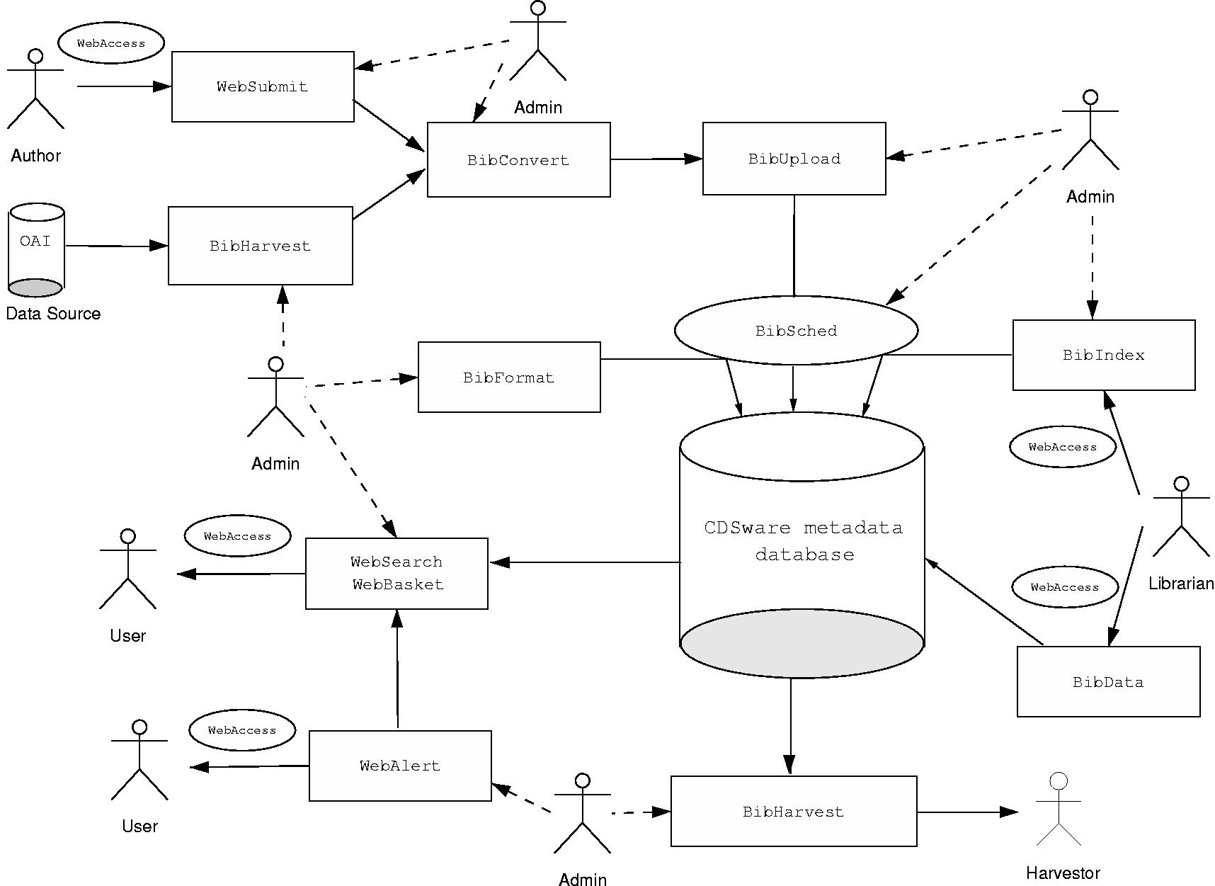 CERN DOCUMENT SERVER DOCUMENT MANAGEMENT SYSTEM FOR GREY LITERATURE
 COMUNICACIÓN INTERNA LA LEY 311995 DE 8 DE
PROGRAMA DE LA ASIGNATURA HISTORIA DE LA DANZA
 MARYBOROUGH SPECIAL SCHOOL LEARNING FOR LIFE 164 WOODSTOCK STREET
ZAŁĄCZNIK NR 3 DO UCHWAŁY NR 82521A2017 KRAJOWEJ RADY
METAMORPHOSES OF SUFFERING NARRATIVE AND BODILY TRANSACTIONS OF MEANING
MOBILITY AND INDEPENDENCE EARLY YEARS ABOUT THIS GUIDE
SERVICIO DE SITIOS WEB PROMOCIONALES (PROMOCIÓN DE EVENTOS) I
STREFA – POWIAT WOŁOMIŃSKI INFORMACJA NA TEMAT DZIAŁAŃ PODJĘTYCH
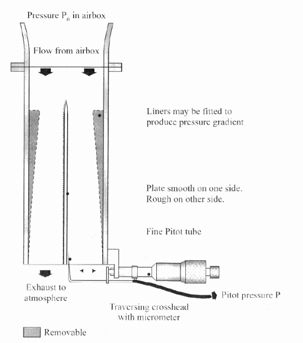 BOUNDARY LAYERS OBJECT THE OBJECT OF THIS EXPERIMENT IS
 THE FUTURE OF THE CBD PROGRAMME OF WORK ON
APSTIPRINĀTA IEPIRKUMA KOMISIJAS 2016GADA 19AUGUSTA SĒDĒ (PROTOKOLS NR 1)
 HUMBER BRANCH MEETING MINUTES FOR MEETING TO BE HELD
REGULAMIN REKRUTACJI I UCZESTNICTWA W PROJEKCIE „KLUBY SENIORA W
 ODDELEK ZA KMETIJSKO SVETOVANJE IZPOSTAVA LOGATEC STARA C 8
 N ETWORK USERS SHOULD USE THIS FORM TO REQUEST
ZARZĄDZENIE NR 2004 Z DNIA 30 KWIETNIA 2004 ROKU
NA OSNOVU ČLANA 10 STATUTARNE ODLUKE O ORGANIZACIJI GRADA
