3 MAKING DATA MEANINGFUL A GUIDE TO WRITING STORIES
0 WARNING THE MAKING OF A FALSE1 “MAKING CITIES RESILIENT” WORLD DISASTER REDUCTION CAMPAIGN 201011
1 RUNNING HEAD MAKING SENSE OF NONSENSE WORD FLUENCY
11 MAKING POPULATION PYRAMIDS FOR DISTRICTS (AND WINNIPEG CASNCS)
13 DECEMBER 2016 THE RIGHTS OF COMMUNICATION AND MAKING
1848 WIS JI‑CRIMINAL 1848 1848 UNEMPLOYEMENT INSURANCE FRAUD MAKING
Guide to Statistical Storytelling
 Making
Data Meaningful:
A guide to writing stories about numbers
Making
Data Meaningful:
A guide to writing stories about numbers
UNITED NATIONS ECONOMIC COMMISSION FOR EUROPE
Making Data Meaningful:
A guide to writing stories
about numbers

UNITED NATIONS
Geneva, 2005
Table of Contents
……………………
3 What is a statistical story? 3
6 How to write a statistical story 6
7 Writing about data: Make the numbers “stick” 13
9 Before and after: Applying good writing techniques 19
1Preface
The methodological material Making Data Meaningful: A guide to writing stories about numbers, was prepared within the framework of the United Nations Economic Commission for Europe (UNECE) Work Session on Statistical Dissemination and Communicationi, under the programme of work of the Conference of European Statisticians.ii
The Guide was prepared by an expert group, in cooperation with the UNECE secretariat. The following people were responsible for its preparation (in alphabetical order):
Colleen Blessing, United States Department of Energy
Vicki Crompton, Statistics Canada
Dag Ellison, Statistics Norway
John Flanders, Statistics Canada
John Kavaliunas, United States Census Bureau
David Marder, Office of National Statistics, United Kingdom
Steve Matheson, Australian Bureau of Statistics
Kenneth Meyer, United States Census Bureau
Hege Pedersen, Statistics Norway
Sebastian van den Elshout, Statistics Netherlands
Don Weijers, Statistics Netherlands
Marianne Zawitz, United States Bureau of Justice Statistics
2About this guide
This guide is designed as a practical tool to help managers, statisticians and media relations officers use text, tables, graphics and other information to bring statistics to life using effective writing techniques.
It contains suggestions, guidelines and examples – but not golden rules.
This document recognizes that there are many practical and cultural differences among statistical offices, and that approaches vary from country to country.
3What is a statistical story?
On their own, statistics are just numbers. They are everywhere in our life. Numbers appear in sports stories, reports on the economy, stock market updates, to name only a handful. To mean anything, their value to the person in the street must be brought to life.
A statistical story is one that doesn’t just recite data in words. It tells a story about the data. Readers tend to recall ideas more easily than they do data. A statistical story conveys a message that tells readers what happened, who did it, when and where it happened, and hopefully, why and how it happened. A statistical story can provide:
general awareness/perspective/context; and
inform debate on specific issues.
In journalistic terms, the number alone is not the story. A statistical story shows readers the significance, importance and relevance of the most current information. In other words, it answers the question: Why should my audience want to read about this?
Finally, a statistical story should contain material that is newsworthy. Ask yourself: Is the information sufficiently important and novel to attract coverage in the news media? The media may choose a different focus. But they have many other factors to consider when choosing a story line.
Statistical story-telling is about:
catching people's attention with a headline or image;
providing an easily understood, interesting, entertaining example of a story behind the numbers, and;
encouraging others to consider how the statistics might serve the stories they have to tell.
4Why tell a story?
A statistical agency should want to tell a story about its data for at least two reasons. First, the mandate of most agencies is to inform the general public about the population, society, economy and culture of the nation. This information will guide citizens in doing their jobs, raising their families, making purchases and in making many other decisions.
Secondly, an agency should want to demonstrate the relevance of its data to government and the public. In such a way, it can anticipate greater public support for its programs, as well as improved respondent relations and greater visibility of its products.
Most agencies rely mainly on two means of communicating information on the economic and social conditions of a country and its citizens: the Internet and the media.
The Internet has become an important tool for making access easier to the agency’s information. More and more members of the public access an agency’s data directly on its website. Still, most citizens get their statistical information from the media, and, in fact, the media remain the primary channel of communication between statistical offices and the general public.
An effective way for a statistical office to communicate through both means is to tell a statistical story that is written as clearly, concisely and simply as possible. The goal for the Internet is to better inform the public through direct access. When writing for the media, the aim is to obtain positive, accurate and informative coverage.
Statistics can tell people something about the world they live in. But not everyone is adept at understanding statistics by themselves. Consequently, statistical stories can, and must, provide a helping hand.
Last, but certainly not least, the availability of statistics in the first place depends on the willing cooperation of survey respondents. Statistical agencies cannot just rely on their legal authority to ensure a suitable response rate.
The availability of statistics also depends on the extent to which survey respondents understand that data serve an important purpose by providing a mirror on the world in which we live. The more a statistical agency can show the relevance of its data, the more respondents will be encouraged to provide the data.
5Considerations
Statistical agencies must take into account a number of key elements in publishing statistical stories.
First, the public must feel that it can rely on its national statistical office, and the information it publishes. Statistical stories and the data they contain must be informative and initiate discussion, but never themselves be open to discussion. In other words, the information must be accurate and the agency’s integrity should never come into question.
Statistical agencies should always be independent and unbiased in everything they publish. Stories must be based on high-quality data which are suitable to describe the issues they address. Changes in statistical values over time, for example, can only be described reliably if they exceed the relevant confidence margins.
Agencies should always guarantee the confidentiality of data on individual persons or businesses. Indeed, statistical stories may not identify, or in any way reveal, data on individuals or businesses.
In their statistical storytelling, agencies must take into account the position and feelings of certain vulnerable groups in society. Information on these groups should be made available, but the goal should always be to inform the public. Agencies should never seek publicity for themselves at the expense of these particular target groups.
The authors of this guide suggest that for the benefit of the citizens the statistical agency serves, it should formulate a policy that explains how its practices protect their privacy and the confidentiality of their personal information. This policy should be given a prominent position on the agency’s website.
6How to write a statistical story
Do you have a story?
First and foremost, you need a story to tell. You should think in terms of issues or themes, rather than a description of data. That means that you need to find meaning in the statistics. A technical report is not a story, nor is there a story in conducting a survey.
A story tells the reader briefly what you found and why it is important to the reader. Focus on how the findings affect people’s lives. If readers are able to relate to the information about things in their own lives that are important to them, your article becomes a lot more interesting.
Statistical offices have an obligation to make the data they collect useful to the public. Stories get people interested in statistical information and help them to understand what the information means in their lives. After they read good statistical stories, people should feel wiser, not confused.
Possible topics/themes for stories:
Current interest (policy agenda, media coverage)
Reference to everyday life (food prices, health, etc.)
Reference to a particular group (teens, women, the elderly, etc.)
Personal experiences (transportation, education)
Holidays (Independence Day, Christmas, etc.)
Current events (statistics on a topic frequently in the news)
Calendar themes (spring, summer)
New findings
A regular series (“This is the way we live now”, “Spotlight on xxxx”)
Write like a journalist: The “inverted pyramid”
How can statisticians communicate like journalists? By writing their stories the way journalists do. The bonus is that the media are more likely to use the information.
Journalists use the “inverted pyramid” style. Simply, you write about your conclusions at the top of the news story, and follow with secondary points in order of decreasing importance throughout the text.
Think of an analytical article as a right-side-up pyramid. In your opening section, you introduce the thesis you want to prove. In following sections, you introduce the dataset, you do your analysis and you wrap things up with a set of conclusions.
Journalists invert this style. They want the main findings from those conclusions right up top in your news story. They don’t want to have to dig for the story.
Build on your story line throughout the rest of the text. If the text is long, use subheadings to strengthen the organization, and break it into manageable, meaningful sections. Use a verb in subheadings, such as: “Gender gap narrows slightly.”
The lead: Your first paragraph
The first paragraph, or lead, is the most important element of the story. The lead not only has to grab the reader’s attention and draw him or her into the story, but it also has to capture the general message of the data.
The lead is not an introduction to the story. To the contrary, it should tell a story about the data. It summarizes the story line concisely, clearly and simply.
It should contain few numbers. In fact, try writing the first sentence of the lead using no figures at all.
Don’t try to summarize your whole report. Rather, provide the most important and interesting facts. And don’t pack it with assumptions, explanations of methodology or information on how you collected the data.
The lead paragraph should also place your findings in context, which makes them more interesting. Research shows that it is easier to remember a news report if it establishes relevance, or attempts to explain a particular finding. Exercise caution, though. It’s not a good idea to speculate, especially if your statistical office cannot empirically establish causality, or does not produce projections.
Give enough information so the reader can decide whether to continue reading. But keep it tight. Some authors suggest five lines or fewer – not five sentences – for the opening paragraph.
Poor: A new study probes the relationship between parental education and income and participation in post-secondary education from 1993 to 2001.
Good: Despite mounting financial challenges during the 1990s, young people from moderate and low-income families were no less likely to attend university in 2001 than they were in 1993, according to a new study.
Finally: there is no contradiction between getting attention and being accurate.
Remember:
Focus on one or two findings
Write in everyday language (the “popular science” level)
Create images for your readers
Focus on the things you want readers to remember
Choose the points you think are newsworthy and timely
Good writing techniques
Write clearly and simply, using language and a style that the layperson can understand. Pretend you are explaining your findings to a friend or relative who is unfamiliar with the subject or statistics in general. Your readers may not be expert users who often go straight to the data tables.
Terms meaningful to an economist may be foreign to a layperson, so avoid jargon. Use everyday language as much as possible. If you have to use difficult terms or acronyms, you should explain them the first time they are used.
Remember: on the Internet, people want the story quickly. Write for the busy, time-sensitive reader. Avoid long, complex sentences. Keep them short and to the point. Paragraphs should contain no more than three sentences.
Paragraphs should start with a theme sentence that contains no numbers.

Example: Norway’s population had a higher growth last year than the year before. The increase amounted to 33,000 people, or a growth rate of 0.7%.
Large numbers are difficult to grasp. Use the words millions, billions or trillions. Instead of 3,657,218, write “about 3.7 million.” You can also make data simpler and more comprehensible by using rates, such as per capita or per square mile. Some suggestions:
Use:
Language that people understand
Short sentences, short paragraphs
One main idea per paragraph
Subheadings to guide the reader’s eye
Simple language: “Get,” not “acquire.” “About,” not “approximately.” “Same,” not “identical.”
Bulleted lists for easy scanning
A good editor. Go beyond Spell-Check; ask a colleague to read your article
Active voice. “We found that…” Not: “It was found that....”
Numbers in a consistent fashion: For example, choose 20 or twenty, and stick with your choice
Rounded numbers (both long decimals and big numbers)
Embedded quotes
URLs, or electronic links, to provide your reader with a full report containing further information
Avoid:
“Elevator statistics”: This went up, this went down, this went up
Jargon and technical terms
Acronyms
All capital letters and all italics: Mixed upper and lower case is easier to read
“Table reading”, that is, describing every cell of a complex table in your text
Not Good: From January to August, the total square metres of utility floor space building starts rose by 20.5% from the January to August period last year.
Better: In the first eight months of 2004, the amount of utility floor space started was about 20% higher than in the same period of 2003.
Headlines: Make them compelling
If your agency’s particular style calls for a headline on top of a statistical story, here are some suggestions to keep in mind.
Readers are most likely to read the headline before deciding to read the full story. Therefore, it should capture the reader’s attention. The headline should be short and make people want to read on. It should say something about the findings presented in the article, not just the theme.
Write the headline after you have written your story. Headlines are so important that most newspapers employ copy editors who craft the headlines for every story. Because they are not as familiar with the information, these editors can focus on the most interesting aspects of the story.
In the same vein, statistical agencies might consider a similar arrangement. The individual who writes the headline could be different than the story’s author.
Headlines should:
Be informative, appealing, magnetic, interesting, newsy:
the highest since, the lowest since…
something new
the first time, a record, a continuing trend
Make you want to read the story, not scare you off
Sum up the most important finding
Be no longer than one line of type
Contain few numbers, if any at all
Have a verb or implied verb
Not Good: New report released today (the report is not the news)
Energy conservation measures widespread (too vague)
Prices up in domestic and import markets (what prices?)
Good: Gasoline prices hit 10-year low
Crime down third year in a row
July oil prices levelled off in August
Tips for writing for the Internet
The principles of good writing also apply to writing for the Internet, but keep in mind some additional suggestions.
People scan material on the Internet. They are usually in a hurry. Grabbing their attention and making the story easy to read are very important.
You also have different space limitations on the Internet than on paper. Stories that make the reader scroll through too many pages are not effective. Avoid making the reader scroll horizontally.
Write your text so the reader can get your point without having to read carefully. Use bulleted lists, introductory summaries, clear titles and chunks of content that can stand alone.
Don’t use ALL CAPITAL LETTERS on the Internet, it looks like you’re shouting. Underline only words that are electronic links. Use boldface rather than underlining for emphasis. Avoid italic typefaces because they are much harder to read.
Make sure your story is printed on a contrasting background colour: either light lettering on a dark background or the reverse. High contrast improves readability on the Internet. Make sure items are clearly dated so readers can determine if the story is current.
Graphs
A picture is indeed worth a thousand words, or a thousand data points. Graphs (or charts) can be extremely effective in expressing key results, or illustrating a presentation.
An effective graph has a clear, visual message, with an analytical heading. If a graph tries to do too much, it becomes a puzzle that requires too much work to decipher. In the worst case, it becomes just plain misleading.
Go the extra mile for your audience so that they can easily understand your point.
Good statistical graphics:
Show the big picture by presenting many data points
Are “paragraphs” of data that convey one finding or a single concept
Highlight the data by avoiding extra information and distractions, sometimes called “non-data ink” and “chart-junk”
Present logical visual patterns
When creating graphics, let the data determine the type of graph. For example, use a line graph for data over time, or a bar graph for categorical data. To ensure you are not loading too many things into a graph, write a topic sentence for the graph.
Achieve clarity in your graphics by:
Using solids rather than patterns for line styles and fills
Avoiding data point markers on line graphs
Only using data values on a graph if they don’t interfere with the reader’s ability to see the big picture
Using the appropriate width-to-height ratio (also known as aspect ratio) of about 1.3 units wide to one unit tall
Starting the Y axis scale at zero
Using only one unit of measurement per graphic
Using two-dimensional designs for two-dimensional data
Making all verbal tasks easy to understand:
Not using abbreviations
Avoiding acronyms
Writing labels left to right where possible, except the Y-axis label, which is usually written vertically, from top to bottom.
Using proper grammar
Avoiding legends except on maps and pie graphs
|
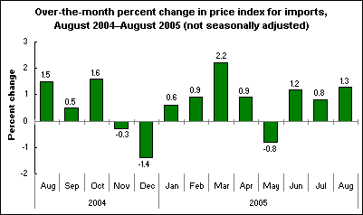
A Good Example This graphiii uses solid colour lines to clearly illustrate change over time. The title gives a concise explanation of the message being illustrated. Data values are used above or below each bar on the graph, but this is appropriate as precise values are useful and there is plenty of space to display them. |
|
Tables
Good tables complement text. They should present numbers in a concise, well-organized fashion to support the analysis. Tables help minimize numbers in the statistical story. They also eliminate the need to discuss insignificant variables that are not essential to the story line.
Make it easy for readers to find and understand numbers in your table. Standard presentation tables are generally small, consisting of 10 or fewer cells. They use a minimum of decimal places, probably no more than one, or the number appropriate for the content.
Presentation tables rank data by order or other hierarchies to make the numbers easily digestible and show the figures that are highest and the lowest, as well as other outliers. Save large complex tables for supporting material.
Always right-justify the numbers to emphasize their architecture. The guidelines listed for graphics above, like highlighting data by avoiding “non-data ink”, also apply to the presentation of tables.
While graphics should be accompanied by an analytical heading, tables should carry only a title to convey the specific topic or message they address.
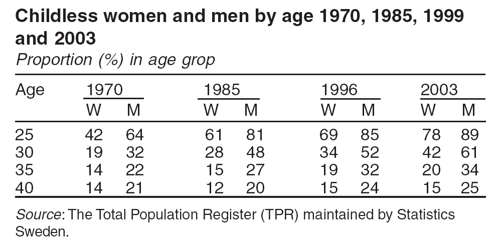
Example of a good tableiv
How to encourage good writing
Each statistical agency may have its own ideas on ways to reward quality writing. But here are some general suggestions.
Set goals, such as a number of stories to be written each year
Reward good writers for the best headline, most contributions, etc.
Make writing an expected part of the job rather than a sideline
Explore techniques for building enthusiasm for writing
Show staff the results of their writing, for example, by posting in the office the newspaper or magazine coverage their stories initiated
Provide training
7Writing about data: Make the numbers “stick”
Numbers don’t “talk”. But they should communicate a message, effectively and clearly. How well they do this depends a lot on how well authors use numbers in their text.
In a sense, journalists and statisticians are from two cultures. They tend not to talk the same language. Journalists communicate with words; statisticians communicate with numbers.
Journalists are often uncomfortable when it comes to numbers. Many are unable even to calculate a percentage increase. So here are some suggestions for making the data “stick:”
Don’t peel the onion. Get to the point:
Poor: “The largest contributor to the monthly increase in the CPI was a 0.5% rise in the transportation index.”
Better: “Higher auto insurance premiums and air fares helped push up consumer prices this month.”
Avoid proportions in brackets:
Poor: “Working seniors were also somewhat more likely than younger people to report unpaid family work in 2003 (12% versus 4%).”
Better: “About 12% of working seniors reported unpaid family work in 2004, three times the proportion of only 4% among younger people.”
Watch percentages vs. proportions: A percentage change and a percentage point change are two different things. When you subtract numbers expressed as proportions, the result is a percentage point difference, not a percentage change.
Wrong: “The proportion of seniors who were in the labour force rose 5% from 15% in 2003 to 20% in 2004.”
Better: “The proportion of seniors who were in the labour force rose five percentage points from 15% in 2003 to 20% in 2004.”
Avoid changing denominators:
Confusing: “Two out of every five Canadians reported that they provided care for a senior in 2001, compared with one in seven in 1996, according to the census.”
Clearer: “About 40% of Canadians reported that they provided care for a senior in 2001, nearly three times the proportion of about 14% in 1996, according to the census.”
Reduce big numbers to understandable levels:
Cumbersome: “Of the $246.8 billion in retail spending last year consumers spent $86.4 billion on cars and parts, and $59.3 billion on food and beverages.”
Easy to grasp: “Of every $100 spent in retail stores last year, consumers spent $31 on cars and parts, compared with only $23 on food and beverages.”
What’s wrong with this article?

A NEW REPORT RELEASED TODAY SAYS THAT THE PRICES OF MANY PETROLEUM PRODUCTS WILL BE HIGHER IN THE FUTURE
The tight global markets and elevated crude oil prices are expected to result in higher prices for petroleum products. The cost of imported crude oil to refineries this winter is projected to average 98.3 c/g (about $40 per bbl) compared to 70.1 c/g last year. During the winter, WTI prices are expected to decline from their current record levels but remain in the $40 per bbl range, but despite above-average natural gas stocks, average winter natural gas prices, both at the wellhead and retail levels, are expected to be above those of last winter, particularly during the fourth quarter of 2004, in response to the hurricane-induced production losses in the Gulf of Mexico during September.
Increases in heating fuel prices are likely to generate higher expenditures even in regions where demand for fuel is expected to fall. Average residential natural gas prices this winter are expected to be 10 percent higher year-over-year and household expenditures are expected to be 15 percent higher.
Therefore, residential space-heating expenditures are projected to increase for all fuel types compared to year-ago levels.
Demand is expected to be up by 1.637 percent. This increase reflects greater heating degree days in key regions with larger concentrations of gas-heated homes and continued demand increases in the commercial and electric power sectors. Due to the availability of primary inventories, many petroleum products are expected to be reasonably well protected against the impact of demand surges under most circumstances. As of October 1, working natural gas inventories were estimated to be 3.6tcf, up 2 percent from three years ago, 3 percent from two years ago and 1 percent from last year.
Other interesting findings from this report are that the spot price for crude oil continues to fluctuate. Prices continue to remain high even thought OPEC crude oil production reached it’s highest levels in September since OPEC quotas were established in 1982. Overall inventories are expected to be in the normal range, petroleum demand growth is projected to slow, and natural gas prices will be will increase.
Headline is too long and doesn’t make a clear point
All-cap headline looks like the author is shouting
Don’t underline words unless they are an electronic link
Lead paragraph is background
Report title and release date aren’t stated
Jargon: Readers might not know that gasoline and heating oil are petroleum products
Spell out units: c/g is cents per gallon; bbl is barrel.
Acronyms: OPEC is the Organization of Petroleum Exporting Counties
First paragraph is too long: Too much detail, too many numbers
Sentences are too long
Lead idea is the third paragraph
Unexplained references: demand for what is expected to be up?
Round numbers: not 1.637 percent.
Elevator economics: this is up, this is down
Bullets preferable in the last paragraph
No URL link cited at the end
No contact or phone number provided
Proof read! In the last paragraph, “thought” should be “though”; “it’s” should be its”.
8Evaluating the impact
Media analysis
It’s a good idea for statistical agencies to monitor the impact of their statistical stories in the print and electronic media from the point of view of both the number of “hits” and the quality of coverage.
Useful resources for gauging the breadth, balance and effectiveness of media coverage include Google News, Lexis, blogs, and electronic and paper subscriptions.
Monitoring coverage can help managers determine if more work is needed to educate journalists, statisticians or key stakeholders about better ways of conveying the meaning of numbers in language that laypeople can understand. Monitoring would include:
Keyword searches to measure extent of media coverage
Total coverage for a pre-determined period of time
Daily coverage to identify spikes
Comparing coverage to established baselines
Prior releases of the same data product
Qualitative methods to analyze media coverage
Correct interpretation of the numbers
Coverage of target audiences
Inclusion of key story-line messages
Inclusion of core corporate messages
Effective use of illustrative embedded graphics
Tone of story (positive/negative)
Tenor of quotes from external spokespersons (positive/negative)
Website analysis
Monitoring Internet traffic with website usage software can help determine types of stories most in demand. You should look for:
The number of page views, visits, etc., to specific pages
Where visitors are coming from
Where visitors are going when they leave your pages
In addition, surveys of users of your site – both media and general users – can help target and improve the information available. You should:
Ask the customer if they found what they were looking for when they came to the site
Target specific questions to known users of the site
Ask how the site is used and how often
Assess general satisfaction with the site
Solicit recommendations for change or additional topics
Use focus groups with media representatives to explore needs, approaches and reactions
9Before and after: Applying good writing techniques
To illustrate how to turn a routine statistical story into one with a much stronger story line and more effective use of data, here is a ‘before’ and ‘after’ example. Note the differences.
BEFORE
Divorces
2003
In 2003, 70,828 couples divorced, up a slight 1.0% from the recent low of 70,155 in 2002.
The number of divorces has remained relatively stable over the last few years. The year-to-year change has been below two percent for every year since 1999.
The increase in the number of divorces between 2002 and 2003 kept pace with the increase in the Canadian population over this period. As a result, the crude divorce rate for 2003 remained the same as in 2002, at 223.7 divorces for every 100,000 people in the population.
The 1.0% increase in the number of divorces across Canada is primarily due to a 5.1% increase in the number of divorces in Ontario and a 1.4% increase in Quebec between 2002 and 2003. Prince Edward Island and Saskatchewan were the only other provinces to experience an increase in the number of divorces between these years. Newfoundland and Labrador showed the largest percentage decrease by far in the number of divorces, down 21.4%.
Repeat divorces, involving people who had been divorced at least once before, are accounting for an increasing proportion of divorces.
In 1973, only 5.4% of divorces involved husbands who had previously been divorced. Thirty years later this proportion has tripled to 16.2% of all divorces.
The proportion of divorces involving wives who had previously been divorced is similar, rising from 5.4% to 15.7% over this thirty year period.
Marriage stability can be assessed using divorce rates based on years of marriage. The proportion of marriages expected to end in divorce by the 30th wedding anniversary inched up to 38.3% in 2003, from 37.6% in 2002.
The divorce rate varies greatly depending on how long couples have been married, rising rapidly in the first few years of marriage. The peak divorce rate in 2003 occurred after three years of marriage, when 26.2 out of 1,000 marriages ended in divorce. The risk of divorce decreased slowly for each additional year of marriage.
The custody of dependents, the vast majority of whom are children aged 18 and under, was granted through divorce court proceedings in 27% of 2003 divorces
In the remaining divorces, couples arrived at custody arrangements outside the divorce proceedings, or they did not have dependents. The number of dependents in these divorces is not available.
There has been a 17-year trend of steady increases in joint custody arrangements. Of the 33,000 dependents for whom custody was determined through divorce proceedings in 2003, 43.8% were awarded to the husband and wife jointly, up 2.0% from 2002. Under a joint custody arrangement, dependents do not necessarily spend equal amounts of their time with each parent.
The custody of 47.7% of dependents was awarded to the wife and 8.3% to the husband in 2003. In 2002, these percentages were 49.5% and 8.5%, respectively.
The shelf tables Divorces, 2003 (84F0213XPB, $22) are now available.
For general information or to order custom tabulations, contact Client Custom Services (613-951-1746; [email protected]). To enquire about the concepts, methods or data quality of this release, contact Brent Day (613-951-4280; [email protected]) or Patricia Tully (613-951-1759; [email protected]), Health Statistics Division.
AFTER
|
Divorces – 2003
Repeat divorces, those involving people who had been divorced at least once before, are accounting for an increasing proportion of divorces in Canada, according to new data.
In 1973, only 5.4% of divorces involved husbands who had previously been divorced. Some 30 years later, this proportion has tripled to 16.2% of all divorces.Similarly, the proportion of divorces involving wives who had previously been divorced rose from 5.4% to 15.7% during this three-decade period.
The number of couples getting a divorce in 2003 edged up 1.0% from a year earlier to 70,828. This slight increase was due primarily to a 5.1% jump in divorces in Ontario, and a 1.4% increase in Quebec. Prince Edward Island and Saskatchewan were the only other provinces to experience an advance.
The number of divorces fell 21.4% in Newfoundland and Labrador, by far the largest decline. No information on the reason for this decrease is available. |
|
||||||||||||||||||||||||||||||||||||||||||||||||||||||||||||||||||||||
|
The number of divorces has remained relatively stable over the last few years. The year-to-year change has been below 2% since 1999. The slight rise in divorces in 2003 kept pace with the increase in the Canadian population. |
|||||||||||||||||||||||||||||||||||||||||||||||||||||||||||||||||||||||
|
As a result, the crude divorce rate for 2003 remained stable at 223.7 divorces for every 100,000 people in the population.
Marriage stability can be assessed using divorce rates based on years of marriage. The proportion of marriages expected to end in divorce by the 30th wedding anniversary inched up to 38.3% in 2003, from 37.6% in 2002.
The divorce rate varies greatly depending on how long couples have been married. It rises rapidly in the first few years of marriage. The peak divorce rate in 2003 occurred after three years of marriage, when 26.2 out of 1,000 marriages ended in divorce.
The risk of divorce decreased slowly for each additional year of marriage.
The custody of dependents, the vast majority of whom are children aged 18 and under, was granted through divorce court proceedings in 27% of 2003 divorces. |
||||||||||||||||||||||||||||||||||||||||||||||||||||||||||||||||||||||
|
Available on CANSIM: table 053-0002. Definitions, data sources and methods: survey number 3235. The shelf tables Divorces, 2003 (84F0213XPB, $22) are now available. For general information or to order custom tabulations, contact Client Custom Services (613-951-1746; [email protected]). To enquire about the concepts, methods or data quality of this release, contact Brent Day (613-951-4280; [email protected]) or Patricia Tully (613-951-1759; [email protected]), Health Statistics Division. |
|||||||||||||||||||||||||||||||||||||||||||||||||||||||||||||||||||||||
10Examples of well-written statistical stories
There are many sources of examples of well-written stories and this guide can only touch on some of them. You can find more examples on the Intranet, in newspapers and in statistical publications. Here are a few ideas of where you can start looking:
Statistics
Netherlands regularly publishes short articles on the Intranet as
part of their ‘Webmagazine’ series. The articles show
how to incorporate graphics to make the message
clear.
http://www.cbs.nl/en-GB/menu/publicaties/webpublicaties/webmagazine/
Statistics
Canada has a section on their website called ‘The Daily’.
Here you will find many examples of brief articles and press
releases.
http://www.statcan.ca/english/dai-quo/
Go
to the website of other national statistical offices by starting at
the UNECE’s list of links to statistical
websites.
http://www.unece.org/stats/links.htm
11Further reading
Kosslyn, Stephen M., Elements of graph design, (New York: W. H. Freeman and Company, 1994)
Miller, Jane E., The Chicago guide to writing about numbers, (The University of Chicago Press, 2004)
Tufte, Edward R., The visual display of quantitative information, 1983; Envisioning information, 1990; and Visual Explanations, 1997 (Cheshire, CN: Graphics Press)
Truss, Lynne, Eats, Shoots, and Leaves: The Zero Tolerance Approach to Punctuation, (London: Profile Books Limited, 2003)
UNECE, Communicating with the Media: A guide for statistical organizations, (United Nations, Geneva, 2004) http://www.unece.org/stats/documents/media/guide/
Wallgren, Anders; Wallgren, Britt; Persson, Rolf; Jorner, Ulf; and Haaland, Jan-Aage, Graphing Statistics & Data: Creating Better Charts, (Thousand Oaks: SAGE Publications, 1996)
i The Work Session on Statistical Dissemination and Communication was conducted in February 2005. Copies of all papers and a full report of the meeting are available from the UNECE website at http://www.unece.org/stats/documents/2005.02.dissemination.htm.
ii Information about the Conference of European Statisticians is available from the UNECE website at http://www.unece.org/stats/introces.e.htm.
iii Graph sourced from Bureau of Labor Statistics, United States Department of Labor. Available online at http://www.bls.gov/opub/ted/2005/sept/wk2/art01.htm [accessed 16 September 2005].
iv Table sources from Statistics Sweden publication Women and Men in Sweden: Facts and Figures 2004. Available online at http://www.scb.se/statistik/LE/LE0201/2004A01/LE0201_2004A01_BR_X10ST0402.pdf [accessed 16 September
19 THE UNMAKING OF THE CHINESE PROLETARIAT THE POLITICS
2 MAKING CAPITAL INVESTMENT DECISIONS ESTIMATION OF PROJECT CASH
2013 RULEMAKING TCE MSC CALCULATIONS NOTES 1 THE GROUNDWATER
Tags: guide to, a guide, stories, meaningful, making, writing, guide
- 7 RECTANGLE 33 N° FOLIO RECTANGLE 34 (USO INTERNO)
- FORMATO VERSIÓN 1 RESUMEN EJECUTIVO INFORME AUDITORÍA INTERNA DE
- 7 GENERATING A RBCL STANDARD CURVE SETTING UP THE
- FREEDOM OF INFORMATION ACT REQUEST PLEASE REVIEW
- CONTRATO DE COMPRAVENTA DE VIVIENDA SOBRE EL PLANO EN
- KIAURAS NAUJOJO MIESTO SIMBOLIS DAUGIABUTIS UŽ VILNIAUS ŽALIOJO TILTO
- 2 MERKBLATT SOZIALHILFE FÜR VORLÄUFIG AUFGENOMMENE PERSONEN FÜR FLÜCHTLINGE
- OŠ TITUŠA BREZOVAČKOG ŠPANSKO1 10090 ZAGREB PROVEDBENI
- CARMEN SOTO VARELA SSJ PROFETA EN TIEMPOS DIFICILES
- NACIONALINIS KONKURSAS “BLAIVI KLASĖ“ 2011 DALYVIO TĖVŲ SUTIKIMAS AŠ
- Vijeće Veleučilišta i Visokih Škola Republike Hrvatske 547 na
- 7122021 ELKA AUSTRALIA PAGE 4 SALES OF BLUE NOOSA
- CUESTIONARIO PARA DETERMINAR EL COEFICIENTE INDIVIIDUAL DE IMAGEN PROFESIONAL
- CONVOCATORIA MIXTA A LA LICITACIÓN PÚBLICA ELECTRÓNICA INTERNACIONAL ABIERTA
- CON PROYECTO DE DECRETO POR EL QUE SE REFORMAN
- PAOLA PUCCINI BIO PAOLA PUCCINI NATA A
- 7 LA CONDICION FÍSICA DEL SUELO Y SU IMPORTANCIA
- SVEUČILIŠTE U ZAGREBU FILOZOFSKI FAKULTET IVANA LUČIĆA 3
- PROTOKÓŁ NR XXVII09 RADY GMINY JELENIEWO Z DNIA 21
- VISTO LA NECESIDAD DE ATENDER EN FORMA FEHACIENTE EL
- NAZIV PREDMETA AUTOMATIZACIJA BRODSKIH STROJNIH SUSTAVA II KOD PFE108
- MATERIAL FOR EGMS NAPOCHIM SA DATED 1920072021
- 20TH TECHNICAL CONSULTATION AMONG REGIONAL PLANT PROTECTION ORGANIZATIONS 25
- 16 POJAM MIGRACIJE – MIGRACIJSKI TERMINI I KONCEPTI ZNANOSTI
- 71 DUBROVAČKE LJETNE IGRE 10 SRPNJA – 25 KOLOVOZA
- SSPP LITURGICAL MINISTRIES SIGN UP LIST –DECEMBER 2627 &
- 7 CINCO LECCIONES SOBRE LA LIBERTAD ANTONIO MILLÁN
- REUSING TEAM MANAGER LITE FOR ELECTRONIC TRACK AND FIELD
- INTESTAZIONE AL SINDACO DEL COMUNE DI POLLONE PIAZZA VINCENZO
- TECNICA E DIDATTICA DEGLI SPORT NATATORI 2 PRESENTAZIONE
10411 ISAC “INTENSIFIED SUPPORT & ACTION COUNTRIES”
22 AĞUSTOS 2012 ÇARŞAMBA RESMÎ GAZETE SAYI 28389
 TAJUK SOALAN PJPK TINGKATAN 2 TUNJANG KECERGASAN
M211MR PART XI CHAPTER 4 SECTION D SECTION D
BEGRAVELSESBYRÅET PUNTERVOLL AS PRISOVERSIKT FOR GRAVFERD EKSEMPEL PÅ PRISER
TERRORISM ABUALYAZID OF ALQAIDA IN AFGHANISTAN ADMITS DIRE NEED
LOS MEDIOS COMO RECURSOS DIDÁCTICOS UN USO CORRECTO DE
 OFFICE OF THE AUDITING AND ASSURANCE STANDARDS BOARD SECTION
 AMPERA FUNDING INITIATIVE TRANSNATIONAL CALL FOR PROPOSALS 200 7
KUCICA GOST SKOLA SKIJANJASNOWBOARD SEDMICNA LIFT KARTA MI OVDJE
3 UNDÉCIMA SEMANA EN GINEBRA 14 A
 T EORETICA UMAN FILOLOGIE TEORETICA UMAN
 Veteran-Military-Culture101
精神科常見用藥 20116友靖老師製 商品名(劑量) 學名 藥理機轉 副作用 注意事項(外觀敘述) ATIVAN(ANXICAM) LORAZEPAM
 COMUNICADO DE PRENSA MARZO DE 2018 RENAULT ENTREGA 180
 2 155 Pielikums Ministru Kabineta 2016 Gada 20 Decembra
 UNIDAD 3 31 ESTRUCTURA ACTUAL DE LA BALANZA DE
ZARZĄDZENIE NR 82010DGL PREZESA NARODOWEGO FUNDUSZU ZDROWIA Z DNIA
 NR 120 JUNI – JULI AUGUST 2017 ÆLDRECENTER
REGULAMIN POSTĘPOWANIA SĄDÓW KOLEŻEŃSKICH POLSKIEJ IZBY GOSPODARCZEJ OŚRODKÓW SZKOLENIA
