CENSUSINFO USER INTERFACE 7 WORKBOOK USER INTERFACE WORKBOOK CARICOM
CENSUSINFO USER INTERFACE 7 WORKBOOK USER INTERFACE WORKBOOK CARICOMT RAINING COURSE CENSUS INFO 5 WORKBOOK CENSUSINFO TRAINING
New Features in DI 6
![]()
CensusInfo
User Interface
Workbook

User
Interface Workbook
CARICOM - Georgetown


r1
Case Study
To further strengthen and support economic and social development in the CARICOM region, the Office of the Executive Secretary has decided to prepare a report on the current social and economical issues in the region.
You are nominated as the Project Officer to help prepare the report for Guyana. You are an expert in using CensusInfo to search for relevant data and generate powerful presentation objects including tables, graphs and maps. A country database is available containing data for selected indicators at the regional level. Please use the database CensusInfo 2010 Guyana Sample Database.mdb to perform the following tasks.
Using Homepage
Task 1
You have installed the CensusInfo User Interface application in your office. Your team members want to know if there are any updates available for the application. Please help them update the CensusInfo User application on their computer.
Task 2
You have updated the CensusInfo User application and now want to use the database. Your team is interested to know what records are available on female literacy for the Barima-Waini region. Please use the advanced search options to generate the required data view.
Task 3
Your colleague in the Labour section wants to know if there is any data on unemployment among females in the various regions of Guyana. Please help him generate an appropriate data view using advanced data search option.
Task 4
The Education section head is excited to learn about the initiative of using CensusInfo for preparing reports. She has learnt that the country database contains data on various enrolment ratios. She wants your help in identifying all the indicators that represent enrolment ratios. Please help her identify the indicators.
(Hint: Use search box on indicator page)
Data Query (Using Data wizard)
Task 1
The Population section wants to generate a table presentation on the general fertility rate in all the regions for the most recent time period. Please help him generate the table using the data wizard. Which region has the highest general fertility rate?
Task 2
You were informed by the Population section that Guyana has reported the total population size data for 1841, 1881, 1921, 1960 and 2002. They now want to create a table depicting the total population size for those years. Please use the data wizard to quickly create the required table.
Task 3
The Demographic section is interested in creating a graph to show the most recent data on the number of households in the regions of Guyana. Please help them use the Data Wizard to quickly create a bar graph showing the status. Show the bars in the graph in sorted order to identify the regions arranged from lowest to highest on data values.
Task 4
The Education section suggests creating maps on adult literacy rate for male, female and total categories, to help identify disparities. Please help the section to use the data wizard to quickly create three maps showing the most recent data for all the regions of Guyana disaggregated by male, female and total categories.
(Hint: Learn to change the subgroups and save separate maps)
Data Query (Classic method)
Task 1
Your colleague has requested your help to work on the demographic section of the report. He wants to search data on the average household size in the 10 regions of Guyana, for all time periods available. Please help him to create a data view showing where data is available.
Task 2
After generating the required data view, he wants to filter the data to show only the most recent data available. How many data records were searched before and after the filter? He now wants to analyze the data by presenting only data from regions which have a household size of 5.0 or more. Please help him to filter the data view as per the above criteria.
Task 3
The expert is now interested to search the data for Demerara-Mahaica. Please help him to clear all the filters applied previously on the data view. You can demonstrate the use of Auto Filter by column option to filter and view the records for the desired region.
Task 4
Another colleague from the Education section is requesting your help to perform the following tasks:
To view the data on net enrolment ratio in secondary education for female, male and total for the various regions in Guyana
To view metadata details including the definition and data availability for the net enrolment ratio in secondary education indicator.
To filter the dataset to display on those records where the net enrolment ratio is less than 60 percent.
To export the filtered dataset into PDF format for dissemination.
To obtain the statistical details including mean, standard deviation and variance of the filtered dataset.
Data Presentation (Table)
Task 1
One section of the report is “Gender Disparities in Education” for the country. You are requested to create a table displaying the net enrolment ratio in secondary education for female and male students, to view the trends in the data. Please create the table for all the regions of Guyana. Use the pivoting feature to show the subgroups in rows and regions in columns. Also use Auto Fit feature to adjust the table, provide an appropriate title, and save the table in the Gallery for dissemination.
Task 2
In the same section, your team wants to include a table on average household size in the following regions of Guyana – Upper Takatu-Upper Essequibo, Potaro-Siparuni and Upper Demerara-Berbice - for 2002. Please help to create the table. Customize the table by providing appropriate titles, change the font type/style/type of the titles, let the row colors alternate between yellow and pink, and then save the table.
Task 3
Your colleagues are impressed with the table and the formatting features available. Please save the table as report layout.
Task 4
Your director has suggested creating a table to depict the co-relation among population size, adult literacy rate and unemployment rate. She wants to create a table showing the five regions with the highest population size along with their adult literacy rate and unemployment rate for the most recent data available. Help her create a table by searching and filtering the required data. She does not want to show the time period in the table. Provide appropriate titles and save the table.
Data Presentation (Graph)
Task 1
You are requested to help the Labour team create a graph for the regions having at least 60 percent of the population working in the non-agricultural sector, for the most recent data. Please help to create the graph. Also help to sort the data in ascending order and add appropriate titles. Save the graph.
Task 2
The Sanitation team is interested to include a pie chart depicting the share of the country’s population using various sanitation practices. Please help the team to create a pie chart showing the Proportion of population by sanitation practices for most recent data available. Provide appropriate titles, legends and also show the share of population as percentage besides the share of each country in the pie chart.
Data Presentation (Map)
Task 1
The Children section of the report has details on the child population of the country’s ten regions. The team decided to create maps on the total population size for the three child age groups: 0-4 yr, 5-9 yr, and 10-14 yr. Please help the team to search the data for the Population size for all three disaggregated categories for most recent data available. Help the team to preview all three maps one by one on the data view page and save them separately.
Task 2
For the maps created in task 1, help the team to edit the default color theme of the 0-4 yr population size map. They want to edit the color theme to provide three breaks using Equal count method to create a simple map. Also help to provide green color shades to all three breaks. Provide appropriate titles and also show data values along with the region names as labels. Save the map in XLS format to share with other team members.
Task 3
The demographic section of the report displays the change in number of households over time, from 1991 to 2002. Please help to create time series maps for the years 1991 and 2002 for all the regions of Guyana showing the number of households using a color theme. Edit the color theme to show three breaks as follows: Low, Medium and High categories, grouping data values up to 4000 as Low, 4000 to 12,000 as Medium and above 12,000 as High. Use red color shades to represent the breaks. Change the color of the boundary lines between regions to black. Show the maps for both years along with appropriate titles and labels, and save the maps for later use.
Task 4
The demographic section also wants to display the same data (in Task 3) using a dot density theme for the most recent data available. Each dot should represent 1,000 households. Make the dots red. Show labels on the map and save the map.
Task 5
Furthermore, the demographic section wants to overlay the dot density map created in Task 4 on Google Earth to create a raster image, to show population density with respect to topography. Increase the size of the dots to highlight visibility.
Task 6
The Sanitation section wants to explore whether there is a relationship between female illiteracy and toilet use, to test the hypothesis that increasing adult female literacy will also raise awareness of toilet use. Please help to create a color theme map for the most recent data for female adult illiteracy rate. Use red color shades to represent these breaks. Overlay this color theme with a column chart theme showing the proportion of the population using no toilet facility. Make the color of the columns blue. Display labels only for those regions with the highest female illiteracy rates. Is there a correlation between the two indicators?
Report
Task 1
Please open the report saved in Task 3 of creating tables. Now you can use the report layout to generate two other similar reports for the following regions (display the most recent data only):
Pomeroon-Supenaam and Mahaica Berbice
Barima-Waini , Demarara-Mahaica, and Cuyuni-Mazaruni
Save these tables in JPG format to be used for other dissemination purposes.
Gallery
Task 1
You wish to demonstrate the advanced features of the CensusInfo gallery to the team members. One of the features is replication. Open the gallery to view the presentation objects that you created earlier, and select the map created as Task 3 of Map exercises. You can now demonstrate to your team how to replicate the map using the same time period and areas but for the indicator “unemployment rate (total)”. Save the map as a separate object.
(Hint: Use the Refresh feature)
Task 2
Use all the objects created earlier to prepare a PowerPoint presentation using the CensusInfo gallery. Add two slides to the saved presentation – the first slide for the introduction of your presentation and the last slide for various analytical comments on the presentation objects.
Tags: interface 7, user interface, interface, workbook, censusinfo, caricom
- REQUEST FOR ASSISTANCE AGENCY DETAILS (THE AGENCY COMPLETING THE
- OFFICE OF RESEARCH AND SPONSORED PROGRAMS 1600 HOLLOWAY AVENUE
- VIRUS EMERGENTES Y REERMERGENTES FLOR H PUJOL LABORATORIO DE
- TRAGEDY AND COMEDY PERRINE 1 CAN PLAYS BE CLASSIFIED
- FIGURE 1 FIGURE 1 (CONT) FIGURE 1 (CONT) FIGURE
- CHEVROLET FORTALECE SU POSICIÓN EN LOS MERCADOS EMERGENTES CON
- ALBEMARLE COUNTY PUBLIC SCHOOLS THE ENTERPRISE CENTER ASHBY KINDLER
- NIVEL A1 ACTIVIDAD ELABORADA POR A F LACALLE
- U MOWA O OPŁATACH I WARUNKACH ODPŁATNOŚCI ZA STUDIA
- ESF COFINANCING PARTICIPANT INFORMATION SIX WEEKS AFTER LEAVING THE
- AUTORIZACION CUENTA BANCARIA PARA ADEUDOS DOMICILIADOSSEPA EMPRESA CIF DOMICILIO
- COST ESTIMATE LANDOWNER COUNTY PREPARED BY
- GUÍA PORTAGE I PROGRAMA DE AUTOAYUDA DE 0 A
- COMBINED MANUAL ISSUE DATE 122014 VERIFYING SPONSOR INFORMATION 00101818
- GOVERNORS PROCLAMATION STATE OF WHEREAS SCHOOL LIBRARIES ARE
- PRAVILNIK O NATJECANJIMA HŠSA HRVATSKI ŠAHOVSKI SAVEZ
- ENTERPRISE INFORMATION PORTAL A NEW PARADIGM IN RESOURCE DISCOVERY
- 1 ŽÁDOST O STIPENDIUM POSKYTOVANÉ V PŘÍPADĚ TÍŽIVÉ SOCIÁLNÍ
- ACTA DE LA SESSIÓ NÚM 7 DEL PLE DE
- PERSONAL AND PROFESSIONAL INFORMATION 1 PROPOSED POSITION TROPICAL CYCLONE
- 10 CONSEJOS PARA LOS PADRES DE NADADORES I NO
- COMUNICADO DE PRENSA EL AUDI TT PREMIADO POR
- MEMBRANU PRIJENOS (AKTIVNI PASIVNI) RECEPTORE MEMBRANSKI I AKCIJSKI POTENCIJAL
- NAME PERIOD DOUBLE REPLACEMENT REACTIONS AB + CD
- SEC FORM NO F105 FOR NEW PARTNERSHIP WITH FOREIGN
- REPÚBLICA BOLIVARIANA DE VENEZUELA MISIÓN MÉDICA CUBANA ESTADO ARAGUA
- FINANCIAL ACCOUNTING TOPIC 11 DEFINE AND CALCULATE DEPRECIATION AND
- WEBSITE STUDYING THE WORD OF GOD AUTHORS BRIAN
- STARPTAUTISKĀ BĒRNU FUTBOLA TURNĪRA „DAUGAVPILS CUP2017” DALĪBNIEKU SASTĀVSLIST OF
- GUÍA PRÁCTICA DE MATRICULACIÓN EN EL IDI 201617
PROTOKOLL STYRELSEMÖTE ROCKSULAN 284 TID KL 1900 – 2100
JAWS FOR WINDOWS VERSIÓN 451 INDICE PÁGINA JAWS FOR
TABLE 1 CAN AGRICULTURAL PRODUCTION PROVIDE SUFFICIENT FOOD TWO
 6 DE 6 CLASIFICACIÓN CAMPEONATO DE ESPAÑA XC
?????? HJ????G?????????????????????????????????????????????????????????????????????????????????????????????????????????????????????????????????????????????????????????????????????????????????????????????????????????????????????????????????????????????????
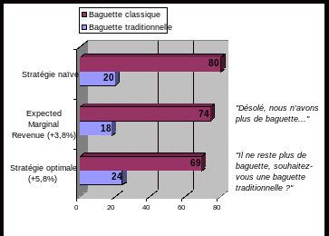
 IL NE RESTE PLUS DE BAGUETTE SOUHAITEZVOUS UNE BAGUETTE
 APPLICATION FORM FOR FEASIBILITY STUDY GRANT LOCAL ENTERPRISE
 DRUSKININKŲ MIKALOJAUS KONSTANTINO ČIURLIONIO MUZIKOS MOKYKLOS DIREKTORIUS ĮSAKYMAS DĖL
3 P SALDARRIAGA VERANO DE 2009 TÓPICOS (TOPUS
THE KNOWLEDGE AND ATTITUDES ABOUT BREAST CANCER OF WOMEN
 FREE MOVER STUDENT APPLICATION FORM IMPRESO DE SOLICITUD
CUMHURİYET ÜNİVERSİTESİ REKTÖRLÜĞÜNDEN ÜNIVERSITEMIZIN AŞAĞIDA YAZILI BIRIMLERINE 2547 SAYILI
 MODEL VAN BELEIDS OF INTENTIEVERKLARING VOOR BOUWBEDRIJVEN DIE DE
 TOWARDS AN ONTOLOGYBASED ICONOGRAPHY ABSTRACT THIS ARTICLE DESCRIBES WORK
ACORDO PARTICULAR DE PROPRIEDADE INTELECTUAL PELO PRESENTE ACORDO PARTICULAR
 CURRICULUM VITAE (CV) A PERSONAL INFORMATION SURE NAME FIRST
OLSZANKA DNIA 14032018 R INFORMACJA ZGODNIE Z ART 37
HRVATSKI GIMNASTIČKI SAVEZ ZAGREB TRG KREŠIMIRA ĆOSIĆA 11 IZVRŠNI
LEVEL CROSSINGS ACT 1983 THE [NAME OF OPERATOR] [NAME
 PAYMENT METHOD – DIRECT DEPOSIT OF SALARY INSTRUCTIONS