MICROSOFT® OFFICE® 2007 STEPBYSTEP FOR EDUCATORS CREATE A
MICROSOFT® OFFICE® 2007 STEPBYSTEP FOR EDUCATORS CREATE AAPPLICATION TEMPLATE CONTACTS MANAGEMENT MICROSOFT® WINDOWS® SHAREPOINT® SERVICES
APPLICATION TEMPLATE PHYSICAL ASSET TRACKING AND MANAGEMENT MICROSOFT®
APPLICATION TEMPLATE TIMECARD MANAGEMENT MICROSOFT® WINDOWS® SHAREPOINT® SERVICES
ATRAIGA NUEVOS CLIENTES UTILIZANDO PUBLISHER APLICA A MICROSOFT® OFFICE
BEGINNING MICROSOFT® POWERPOINT PRACTICE 1 RUBRIC 0 3 5

Microsoft®
Office®
2007
Step-by-Step for Educators
Create a Graph in Excel 2007
Charts are used to display series of numeric data in a graphical format to make it easier to understand large quantities of data and the relationship between different series of data.
About charts and their elements
A chart has many elements. Some of these elements are displayed by default. Chart elements can be added, removed, moved, resized, or changed.
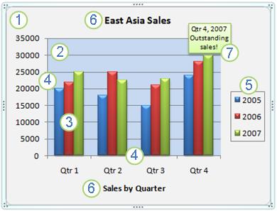
![]() Chart
area
Chart
area
![]() Plot
area
Plot
area
![]() Data
points of the data series
Data
points of the data series
![]() The
horizontal (category) and vertical (value) axis
The
horizontal (category) and vertical (value) axis
![]() Legend
Legend
![]() Chart
and axis title
Chart
and axis title
![]() A
data label used to identify the details of a data point in a data
series
A
data label used to identify the details of a data point in a data
series
When you click anywhere in the chart area, and then hover the mouse pointer over one of these elements, Excel displays information about that element in a ScreenTip. Clicking anywhere in a chart also makes the Chart Tools available, adding the Design, Layout, and Format tabs.

Available chart types
Excel 2007 supports many types of charts to help you display data in ways that are meaningful to your audience. The following are some of the more commonly used chart types available.
Chart Type |
Chart Example |
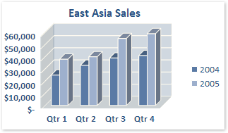
Column chartsData that is arranged in columns or rows on a worksheet can be plotted in a column chart. Column charts are useful for showing data changes over a period of time or for illustrating comparisons among items. |
|
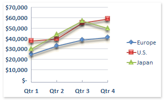
Line chartsData that is arranged in columns or rows on a worksheet can be plotted in a line chart. Line charts can display continuous data over time, set against a common scale, and are therefore ideal for showing trends in data at equal intervals. In a line chart, category data is distributed evenly along the horizontal axis, and all value data is distributed evenly along the vertical axis. |
|
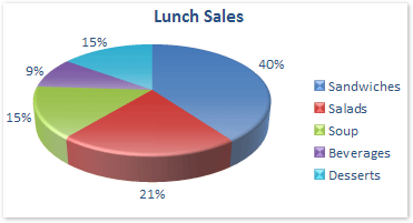
Pie chartsData that is arranged in one column or row only on a worksheet can be plotted in a pie chart. Pie charts show the size of items in one data series, proportional to the sum of the items. The data points in a pie chart are displayed as a percentage of the whole pie. |
|
Bar chartsData that is arranged in columns or rows on a worksheet can be plotted in a bar chart. Bar charts illustrate comparisons among individual items. |
|
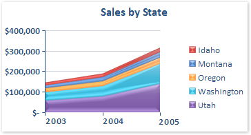
Area chartsData that is arranged in columns or rows on a worksheet can be plotted in an area chart. Area charts emphasize the magnitude of change over time, and can be used to draw attention to the total value across a trend. For example, data that represents profit over time can be plotted in an area chart to emphasize the total profit. By displaying the sum of the plotted values, an area chart also shows the relationship of parts to a whole. |
|
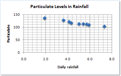
XY (scatter) chartsData that is arranged in columns and rows on a worksheet can be plotted in an xy (scatter) chart. Scatter charts show the relationships among the numeric values in several data series, or plots two groups of numbers as one series of xy coordinates. |
|
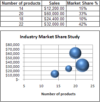
Bubble chartsData that is arranged in columns on a worksheet so that x values are listed in the first column and corresponding y values and bubble size values are listed in adjacent columns, can be plotted in a bubble chart. |
|

Create a chart
Enter the numeric data for the chart on a worksheet in Excel. For most charts, you can plot the data that you arrange in rows or columns. However, some chart types (such as pie and bubble charts) require a specific data arrangement.
Select the cells that contain the data that you want to use for the chart.
On the Insert tab, in the Charts group, do one of the following:
Click the chart type, and then click a chart subtype that you want to use.
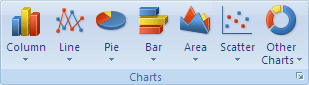
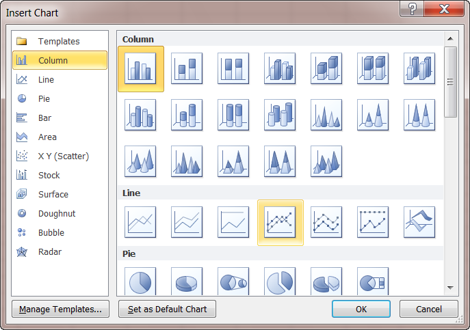
To see all available chart types, click a chart type, and then click All Chart Types to display the Insert Chart dialog box. Click the one you want to use and select OK.
Excel will automatically create your chart. When you click on the chart you want to format, it displays the Chart Tools, adding the Design, Layout, and Format tabs.
Modifying a basic chart to meet your needs
After you create a chart, you can modify any one of its elements. To modify a chart, you can:
Change the pre-defined chart style
Select the chart you want to format.
On the Design tab, in the Chart Styles group, click the chart style you want to use.
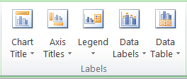
Add titles, axis titles, a legend, or data labels to a chart
Select the chart you want to format.
On the Layout tab, in the Labels group, select the feature you would like to change, then click the display option that you want.
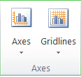
Show or hide gridlines
Select the chart you want to format.
On the Layout tab, in the Axes group, click Gridlines and select the horizontal and/or vertical gridlines you would like to show.
More Information on Office 2007 for educators
For teachers:
www.microsoft.com/education/Office
For faculty:
www.microsoft.com/officeeducation
For more help with Microsoft Office Excel:
http://office.microsoft.com/en-us/excel/FX100646951033.aspx
© 2009 Microsoft Corporation. All rights reserved.
This document is for informational purposes only. MICROSOFT MAKES NO WARRANTIES, EXPRESS, IMPLIED OR STATUTORY, AS TO THE INFORMATION IN THIS DOCUMENT.
Microsoft, Windows, SmartArt, Excel, Internet Explorer, OneNote, PowerPoint, SmartScreen, and Windows Live are trademarks of the Microsoft group of companies. The names of actual companies and products mentioned herein may be the trademarks of their respective owners.
CASOS DE ÉXITO MICROSOFT MICROSOFT® VISUAL STUDIO® NET CAIXA
CASOS DE ÉXITO MICROSOFT MICROSOFT® VISUAL STUDIO® NET PLNT
CASOS DE ÉXITO MICROSOFT MICROSOFT® WINDOWS® XP TABLET PC
Tags: create a, you create, create, educators, office®, microsoft®, stepbystep
- SORSZÁM F422000 ELEMZÉSI TERV ORSZÁGOS EGÉSZSÉGMONITOROZÁSI PROGRAM ORSZÁGOS LAKOSSÁGI
- CHECK COPY FORM EMAIL FORM TO VENDCHECKSRFSUNYORG REQUESTORS NAME
- CARE PLAN FOR FAST TRACK PATIENTS INTERAGENCY MULTIDISCIPLINARY CARE
- 27 WRITTEN FOR MARIE MCGINN (ED) WITTGENSTEIN HANDBOOK (OXFORD
- !doctype Html html Langen head meta Charsetutf8 meta Contentieedge
- E CALL ANHANG NACHWEIS ZUR ANREIZWIRKUNG DER FÖRDERUNG FÜR
- Hezkuntza Unibertsitate eta Ikerketa Saila Hezkuntzako Ikuskaritza
- TARIH………… MANİSA BAĞCILIK ARAŞTIRMA ENSTİTÜSÜ MÜDÜRLÜĞÜ TOPRAK YAPRAK VE
- Allmänna Bestämmelser Reglernas Tillämpning Dessa Regler ska
- BUKU AJAR HUKUM DIPLOMATIK OLEH I GEDE PASEK
- Seniorernas Verksamhetsplan 2018 – 2020 Samtliga Seniorer i Åkersberga
- Välkommen Till Golfkille 2017 Mars 123 Pizzaputtparty Hammarö gk
- ANNUAL O&MREMEDY EVALUATION CHECKLIST FOR CONTAMINATED SEDIMENT REMEDIES OSWER
- REVISTA QUÍMICAVIVA NÚMERO 1 AÑO 2 ABRIL 2003 QUIMICAVIVAQBFCENUBAAR
- A FOTO ENGANXEU UNA FOTO RECENT DEL JUGADORA E
- Träning av Hästar och Elever Kräver Uppdaterade Kunskaper Norska
- MODELLKLUBBEN ESKIL INBJUDER TILL SVERIGE CUP TÄVLING 2010 I
- ANTEPROYECTO RELACIÓN UNIVERSIDAD–ESCUELACOMUNIDAD EN LA PROMOCIÓN DE LA MELIPONICULTURA
- REGLER VID TÄVLING FÖR AKTIVA I TFIK GRUPP 1+2+3
- DEFINING PROJECT RESULTS A GUIDE FOR APPLICANTS PROJECT RESULTS
- IZJAVA KANDIDATA O SOGLASJU IN IZPOLNJEVANJU POGOJEV PODPISANI(A) ROJEN(A)
- Izjava o Unovčitvi Digitalnega Bona 22 Spodaj Navedeni Upravičenec
- UEDAŞ EK MUF VE BAŞLIK EK TEKNİK ŞARTNAME DOKÜMAN
- UMOWA ZAWARTA W DNIU ……………… ROKU W CELESTYNOWIE POMIĘDZY
- RESOLUCIÓN PROCEDIMIENTO ABREVIADO CONCLUIDA LA TRAMITACIÓN DEL PROCEDIMIENTO ABREVIADO
- DOCUMENTO DE TRABALHO DO BRASIL MERCOSUL XXXVI SGT Nº
- ИНФОРМАЦИОННОЕ СООБЩЕНИЕ О ПРОВЕДЕНИИ КОНКУРСА ДЕПАРТАМЕНТ ФИНАНСОВ И БЮДЖЕТНОЙ
- “5000 AÑOS DE LA HISTORIA DEL VIDRIO” EL ORIGEN
- Burttitle meta Namedescription Contentrichard Burt a Professor of
- 8 TD 1424197314248622 OPINIÓN Nº 0342019DTN ENTIDAD INSTITUTO NACIONAL
ATTACHMENT A QUARTERLY PROGRESS REPORT THE FOLLOWING TEMPLATE IS
 IMPRESO DE MATRÍCULA EN UNED SENIOR CURSO ACADÉMICO 20172018
STATE OF OKLAHOMA 1ST SESSION OF THE 50TH LEGISLATURE
 World of Language Academy Grup 76 Session 1 Section
KATOWICE DOSTAWY SPRZĘTU MEDYCZNEGO NIEJAŁOWEGO PN6510 NUMER OGŁOSZENIA 102341
NORMAS GENERALES TORNEO DE FUTBOLSALA “O TE MUEVES O
ITB GRADUATE INTERNSHIP PROGRAMME INTERNSHIP IN FINANCE INTERN FINANCE
CONTOH NASKAH PENJELASAN SEBELUM PERSETUJUAN PENELITIAN (PSP) PENJELASAN SEBELUM
 PARTICIPANT WORKBOOK VALUES BASED DECISION MAKING MAKING GOOD DECISIONS
 APICS AFFILIATED STUDENT CHAPTER CHAPTER MINIMUM STANDARDS (ASCCMS)
 METHOD OF MOMENT ESTIMATES VS MAXIMUM LIKELIHOOD ESTIMATES OF
 EL CABALLERO DE LA ARMADURA OXIDADA RECURSOS PARA ANTES
 COLLEGE ALGEBRA NAME SECT 41 GRAPHING POLYNOMIAL
 TRIGONOMETRÍA – CUARTO DE SECUNDARIA PRÁCTICA DIRIGIDA 1) DESDE
 MINISTERO DELLA PUBBLICA ISTRUZIONE UFFICIO SCOLASTICO REGIONALE PER L’ABRUZZO
CLICCA SUL LINK O RICOPIALO NELLA STRISCIA DELL’INDIRIZZO PER
 MAXEXPLORER A MOBILITÁS MENEDZSMENT PROJEKTEK DÖNTÉSHOZATALT SEGÍTŐ KÉZIKÖNYVE A
 LINE 3 INSTITUTO DE BIOMEDICINA Y BIOTECNOLOGÍA DE CANTABRIA
HİZMET ENVANTERİ TABLOSU SIRA NO SIRA NO KURUM KODU
ATTACHMENT 14 FLORIDA EARLY STEPS EMAIL TEXT TRANSMITTING QA
